In this blog post, we will discuss how to add passwordless functionality to your web app, existing or new. We will use FIDO2 protocol and standard, including WebAuthn protocol – specification, which, due to its adoption by all modern browsers, allows the app, and the app developers to get the public key credentials from an Authenticator, be it a usb fido2 hardware key, your phone face or biometric authentication, or , for example windows hello feature.
Once we are done adding FIDO2 , including it’s WebAuthn protocols and authentication functionality to our app, we will firstly and mostly create a more secure and more adoptable sign in and authentication mechanism for our users to be able to sign in with no passwords at all.
By doing so, we will improve our security for our app because FIDO2 and WebAuthn use public/private keys technology, where private key is only stored in hardware Authenticator of a user that he or she takes with him while sharing public key with FIDO2 enabled app .
I will use asp.net core WebApi for the back end, and NextJs for the front end.
Notes on Passwordless:
- Passwordless is a way to sign in and authenticate without a password.
- The user credential (secret) is not shared with the website or app
- With passwordless, an authenticator is required. It can be USB Security key, iPhone, Android Phone, WIndows Hello Feature etc …
- FIDO2 is a protocol and standard developed by Fido Alliance https://fidoalliance.org/
- Passkeys, also, is simply a new implementation of WebAuthn https://www.w3.org/TR/webauthn-2/
- Some big companies already added Passkeys to serve their clients. The following website lists all who did https://passkeys.directory/
- Passwordless authentication helps secure one’s identity online.
For coding part, I will be using the following stack:
- .NET Core Web API (C#) for backend as an API
- NextJs project for front end and better user experience as a whole
- Free version of MongoDB https://www.mongodb.com/
- Visual Studio Code editor https://code.visualstudio.com/
- Mediator design pattern for C#
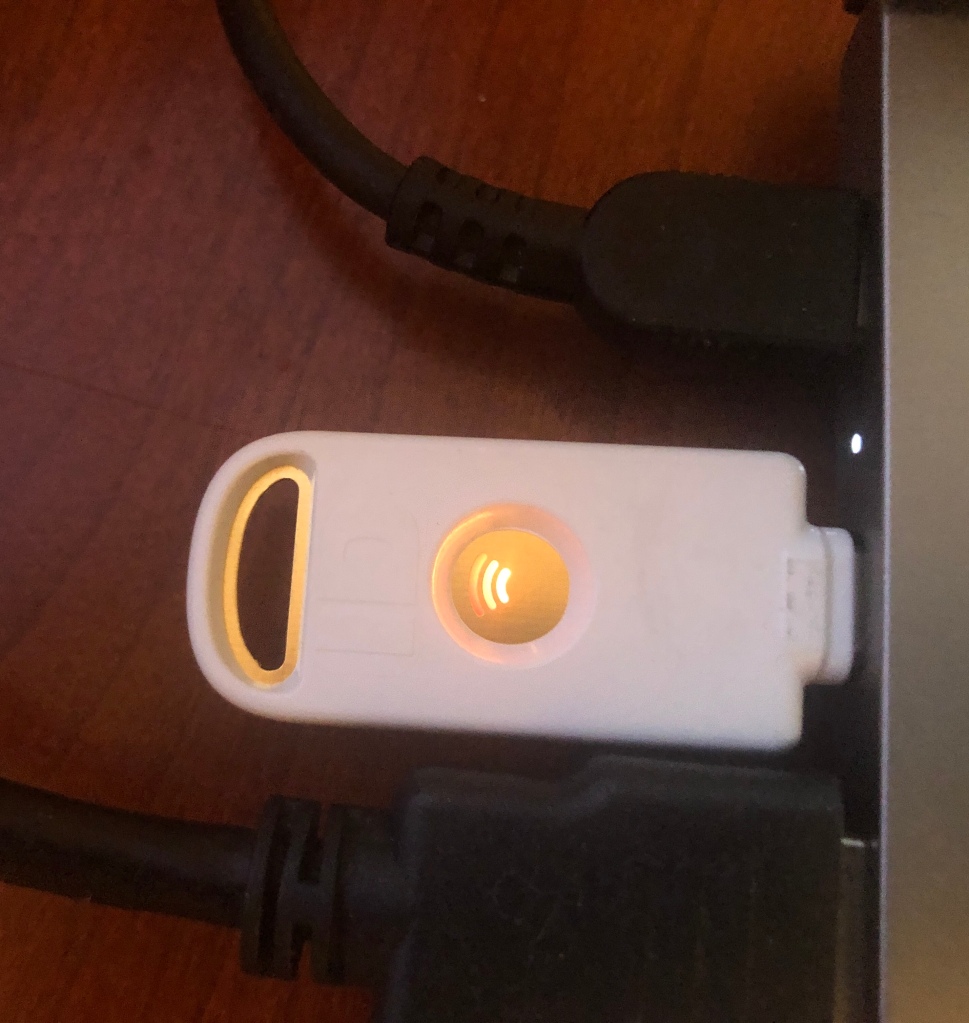
For passwordless with FIDO2 and WebAuthn project I purchased a USB Security key. Here is how it looks:

I did not need to configure it. I started using it to log in to our localhost passwordless small app. Just unpack it and plug it in into your PC or whatever machine you are using to browse the web. This one needs USB-C port.
The area in the middle with three umbrella like arcs lights up when it want you to touch it to authenticate. That is all to it.
Here is the security key in action:
This is the part where you touch it, and the website or app authenticates you. This key, stores its private key and never shares it with the world. What is shares is public key. It shares it with WebAuthn protocol, and FIDO2 protocol. Ofcourse this functionality has to be set up by developer of an app that will support passwordless authentication using FIDO2 and WebAuthn.
On the software part, I have created a UML sequence diagram that our small passwordless app uses. Here is the image:
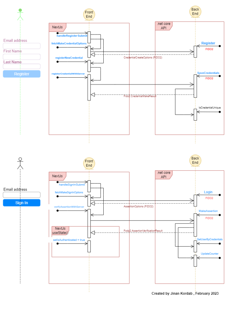
There are two parts to this app: Register, and SignIn.
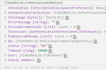
For registration, please look at the first part of the above UML diagram. The steps to commnunicate with FIDO2 protocol are sequential. First we call fetchMakeCredentialOptions on front end, it sends a request to our API to generate Fido2.CredentialCreateOptions. Here is how credentialoptions generated by FIDO2 look like:
Once the client gets back those options, we assemble , so to speak, a public key, which is found here https://www.w3.org/TR/webauthn-2/#sctn-sample-registration and call navigator.credentials.create to trigger our USB Security key (our chosen authenticator for this example) shown above, with the help of browser and WebAutn.
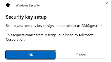
We press OK, and we get second image from our key now:
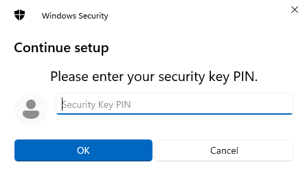
The above image asks for our USB security key pin, which you configured while setting up your key after buying it. With biometric authenticators, and face recognition on iphones, this process is different.
We enter the PIN and press OK. We see this:
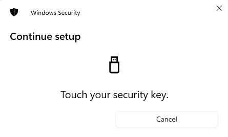
The key asks us to touch it. We touch that three umbrella area which lights up. Just touch it, no fingerprints are collected. This is not a fingerprint scanner.
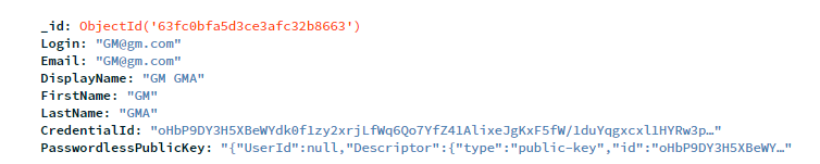
After we touch it, the front end calls registerNewCredential, then it also calls registerCredentialWithServer (front end) and then we call our dotnetcore API SaveCredential method. This method calls fido2.MakeNewCredentialAsync which generates PublicKey, which we can store in our MongoDb. After we store this public key, in addition to First Name, Last Name and an email (username) in our database, we can log in then only with email, and no password required.
For this example, I store this info in database:
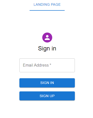
Upon successful registration, we are redirected automatically to SignIn NextJs page:
The sign in process, from above UML Sequence diagram is almost the same. We only use the email address, no password. In the Login method in our API, we ask FIDO2 for assertion options, in order to present them to our authenticator, located right where we are: fido2.GetAssertionOptions.
After we get the assertion options from fido, we call await navigator.credentials.get to trigger our authenticator.
The first window we get is this:
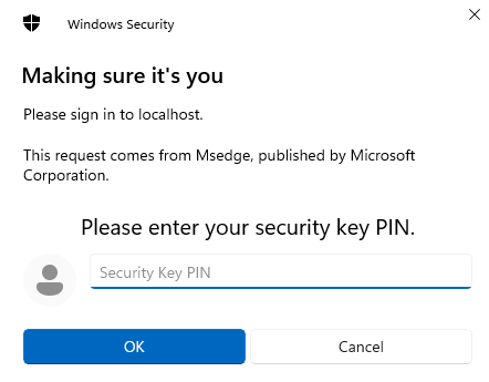
We enter our pin for USB Security key, then it asks us to touch it:
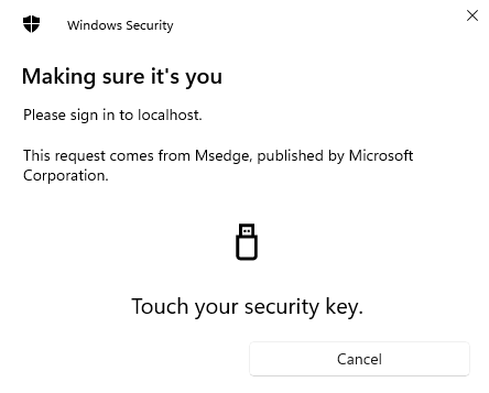
We touch it, and the request goes to MakeAssertion method in our API, but, this time also with our authenticator’s public key. FIDO2 makes its verification, with its internal algorythms ( var result1 = await fido2.MakeAssertionAsync()) and we get a response from the server. This is how response looks like:
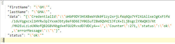
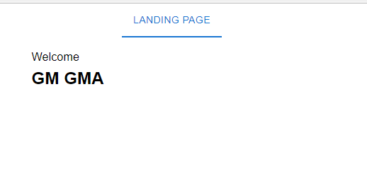
We check the status, it should have the value “ok”. This is from FIDO. If “ok”, we put our user in the NextJs state using useState() hook, and show him or her accordingly the info that they are authorized to see.
The source code is on GitHub: https://github.com/jinan-kordab/passwordless-dotnetcoreapi-nextjs
Thank you.