In my humble understanding, I think that the evolution of UX UI throughout history the way we see it today in software happened because of three or even four factors:
- Industrial revolution
- Newspaper industry
- Paintings ( form of art )
You might argue that everything in software evolved from those things. But if this is the case, why only in recent years that we started to see something like Full Stack Engineers, UX UI designer ? If everything in software evolved from those three things. Oh, I forgot to add a fourth dimension:
- Visual perception ( how our eyes see the world and what they like )
So if everything evolved from those four factors, then why first computers and computer programs were not visual and screen based ? First programs were plain instructions to a computer to perform complex calculations, that is all.
No, it is not a history of software or UX UI article, nor it is a philosophical debate.
I just want to make a point that when designing UX UI screen, we focus on those four factors mentioned above, but translated in different words:
- Control panel items like buttons, labels, handles, switches ( on and off ) that were used in operating a mechanical machine ( industrial revolution )
- Menu bars, headers and footers, and side bars including titles and navigation menus ( Newspaper industry )
- Colors, font thickness, boldness, blurriness, styles ( paintings or form of art )
- Night vision, 2D, 3D, stereoscopic visual design like 3D movies or 3D stereoscopic websites where you need special eyeglasses to look at. Flexibility of components on the page, or flex.( Visual Perception )
That being said, I think considering all those factors above when designing a UX UI screens, SPAs or landing pages, one can be proud of their design from whichever angle you look at it, design wise or functionality wise.
Aren’t we always trying to enhance UX UI ?
There is also a reason why many always use both abbreviations together UX UI when referring to a user interface and front end design. I think it is because in software one cannot separate a good UI design from functionality that it provides because if only saying UI then it would simply be a digital painting, and nothing more.
Here is an image of a confusing UI UX design:

As shiny as it may look, the image above, in my own opinion, let me stop beside it and ponder 3 to 4 minutes, just looking at it, with an open mind. First few seconds I thought it is a stereoscopic image. But it is not.
If you look at it closely, and it is attractive in its own way, you will understand that it is a machine that plays a recording to a tourist about the cultural destination that he or she is at right now, with historical info, etc… in both languages, French and English. There is also French volume slider up and down and English slider.
My mind got confused, although I understood the general idea.But don’t you think if we removed one of the volume sliders, and put the other in the center, and then the two language buttons make them bigger and put them on left and right of the volume, that it would be less confusing? Something like this:

Also, I stumbled across an elevator that has two doors, and a control panel between the doors. Some of the control panel items are very tightly squeezed right beside the doors themselves. I used those elevators and I do not remember which button of them I pressed to call the elevator . I think I pressed them all. Take a look:

Ten buttons ! Three of them, I think , are “key” buttons. Looks like people who made this control panel adored buttons.
By the way, I always thought that standard buttons to force close or force open elevator doors once you are inside also should be redesigned, because they are always confusing to me and each time I spend some time trying to figure with which button to force close the elevator door from inside.
By the way, the elevator control panel above is in a mall with many many visitors each day in a very famous place.
So one might think that too much of a buttons on a screen is confusing and only one button for everything is , well, kind of weird too, and that there must be a middle way, in between the two extremes.
That is not necessary true. Because there is also a depth, or a Z axis to this.,which has to do with our visual perception and comprehension of how we do things on that panel. Meaning that a button does not have to be directly responsible for one and only one action and it may need to be pressed at the same time with another button to mean something.
Have you ever a seen a control panel from Star Trek spaceship ? Here is an example:
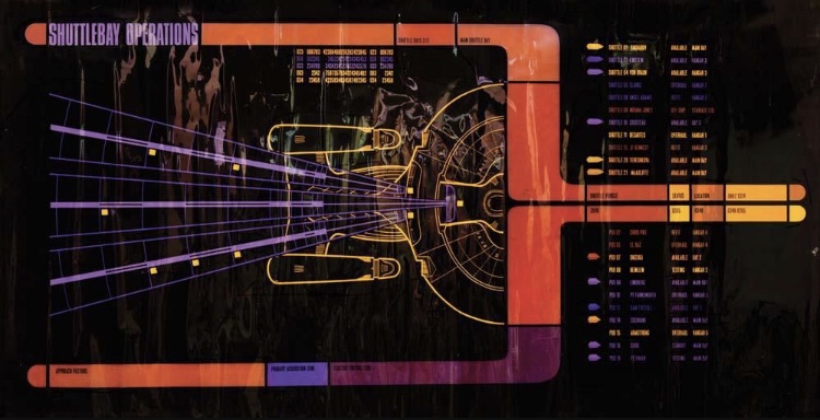
There are a lot of buttons above, for example, but the person operating this control panel has to pass training first because sometimes it is needed to press two buttons with two fingers simultaneously, like when you press two pedals in a manual transmission car. Of course this user interface is harder to design, and it needs to target specific audience.
To summarize, I think UX UI design is simple, as long as we design it that way, and with Component based approach to UX UI design such as React and NextJS, our creativity and acceptance of what we design will increase.
